Innovation & Engineering
UI/UX & Inclusive Design
Great design is inclusive design. We craft modern, brand-aligned interfaces and design systems that meet WCAG 2.2 by construction - accessible color, type, motion and interaction baked into every component.
Overview
Inclusive design is beautiful, functional design. We craft modern, brand-aligned user experiences and design systems in Figma that satisfy WCAG 2.2 AA accessibility requirements by construction, ensuring every user enjoys a seamless, premium interface.
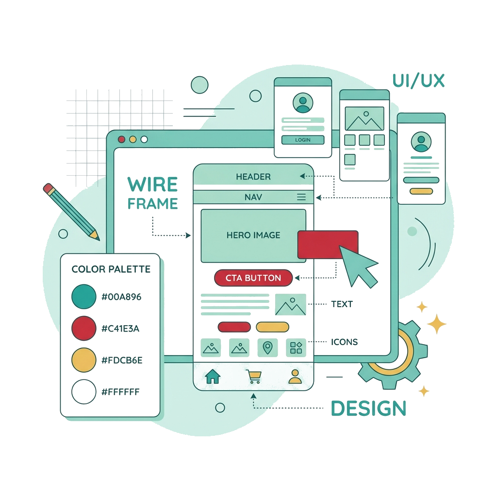
Our design process embeds accessibility at the foundation level - establishing harmonious, high-contrast color palettes, accessible typographic scales, clear focus indicator states, and predictable interactive models. We annotate designs with precise developer specs, documenting tab order, ARIA roles, and screen reader names.
At a glance
- Accessible color, type and contrast systems
- Inclusive interaction and motion patterns
- Reusable, documented design system
- Usability validated with diverse users
Coverage
What we cover
Accessible Color Systems
Creating color palettes in Figma that guarantee a 4.5:1 ratio for body text and 3:1 for UI borders.
Typographic Hierarchies
Structuring clear display and body text relationships that remain legible under browser zoom settings.
Focus State Guidelines
Designing highly visible, custom focus indicator rings that blend with the brand aesthetic.
Interaction & Flow Specs
Drafting user flows, form field states, and responsive layouts annotated for screen readers.
Inclusive Motion Profiles
Designing animations that respect reduced-motion settings, avoiding flashing or scroll-jacking.
Component Library Auditing
Reviewing Figma components to ensure form labels, error states, and buttons are designed accessibly.
Outcomes
What you get
Methodology
How the engagement runs
Research
Understand users, including those who use assistive tech.
Define
Accessible foundations - color, type, spacing, motion.
Design
Components and flows that are usable and beautiful.
Validate
Test with real users and assistive technology.
Deliverables
What lands in your inbox
- Accessible design system (Figma)
- Annotated, dev-ready specs
- Accessibility annotations (focus order, labels)
- Usability findings
FAQ
Frequently asked
Do you hand off to developers?
Yes - with accessibility annotations (focus order, names, roles, states) so the build stays conformant.
Related services
Innovation & Engineering
Accessible Web Development
Modern web apps built accessible (WCAG 2.2) and secure by default, on a performant stack.
Accessibility: Audits & Testing
Accessibility Audit (WCAG 2.2)
Full WCAG 2.2 AA conformance audit across web, mobile and PDF - with prioritized, developer-ready findings.
Need ui/ux & inclusive design?
Prove both before launch.
Bring us your app, audit deadline, or security concern. We'll map the fastest path to WCAG conformance, VAPT coverage, and regulator-ready evidence.